This past year has been an interesting one for watching the performance of stocks & the markets. Between all of the recovery type names, unique ways the TV pundits proposed calculating earnings during the pandemic & market momentum that has been pinned on there being more active participants than usual, there’s been no shortage of entertainment. But something that we haven’t seen much of is people discussing the negative fallout potential that all of this has created.
We all know that stocks take the stairs up, which they’ve been climbing with few faults since March/April 2020, but how far down the elevator ride will be hasn’t really been tested. This may ultimately be more problematic than most folks anticipate the next time around, mainly due to the rapid “recovery” that was made last spring.
A quick dive into the charts of the major indexes shows that the bandaid may be better off being ripped off in the near-term than later.
Breaking Down The Moving Averages Of Major Stock Indexes For 2020 Into 2021
In the last couple of weeks we have seen index levels flirting with their 10 Day Moving-Averages quite a bit, while always managing to break above them slightly & begin to establish new, slightly higher ranges. Something that is particularly troubling about this, is that RSI levels remain on the higher side, while MACD levels are relatively flat.
Treading water is an essential survival skill for maritime activity, but not necessarily the best for your investments & retirement account.
The charts below show how this is bringing major moving averages closer together to levels that may prove to be problematic the next time that even a 10% correction inevitably comes around.
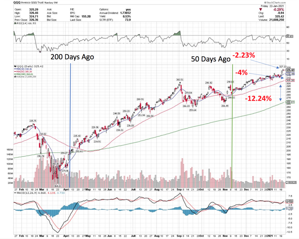
This is the chart for QQQ, tracking the NASDAQ; note the relatively flat MACD levels mentioned before over the last 200 days, minus a few hiccups & the RSI in the last 50 days spending a lot of time cozying up to the 70 level. A 2.23% drop in price level is all that is needed to break below the 10 Day Moving-Average, and the 50 Day Moving-Average is only 4% lower than that.
A 10% correction would push prices below both of these levels in a bearish manner, with the 200 Day Moving-Average 12% below.
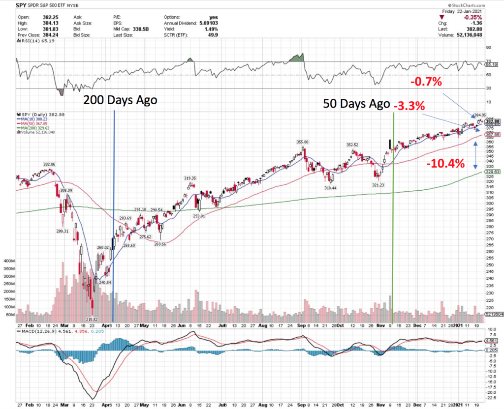
Using the SPY chart above, we see that the S&P 500 has even less room for error, with similar RSI & MACD trends as QQQ. SPY’s price level is less than 1% above its 10 Day Moving-Average, with only 3% lower to go to break the 50 Day MA in a bearish manner, and the 200 Day MA 10% below that.
A 10% correction in prices here will leave the 200 Day MA about the same distance below the current price:50 Day MA level.
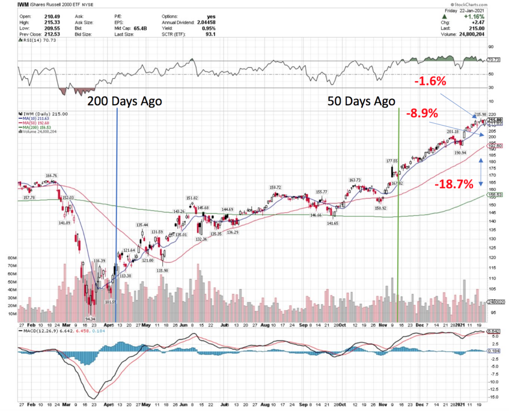
The Russell 2000 has a bit more breathing room, with the IWM ETF price level being 1.6% above its 10 Day Moving-Average, and the space between the 10:50 Day MAs being an additional ~9%.
Applying a 10% correction would breach the 50 Day MA, but the 200 Day Moving-Average is still another ~19% below that, providing more cushion from a technical perspective.
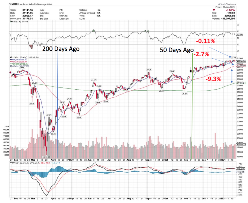
Then we have the Dow Jones Industrial Average, who seems to have it the worst (although also the smallest sample size by components).
With its price level just .11% above the 10 Day MA, the 50 Day MA is another 2.7% below that & the 200 Day MA is only 9% below that level, making a 10% correction a much larger issue from a technical standpoint.
As you can see, from a technical perspective we are standing on bambi legs, as a healthy move to the downside will have most of these indexes flirting with breaking the longer-term trend.
Much of this is due to the need to place money somewhere for growth, and a lot of speculative bets being made, primarily on technology & medicine, which will also likely make the difference between QQQ & IWM become much closer to the SPY & DJIA levels shown above.
A Correction Sooner Than Later Will Be Beneficial To Rip The Bandaid Off
I added in the 200 day & 50 day yardsticks above, as it highlights that there is an additional problem posed by the rapidness of the market’s recovery. The recovery speed of last spring for the most part outpaces the performance of the more recent time periods, which is somewhat of a life-ring for the longer-term moving averages shown above.
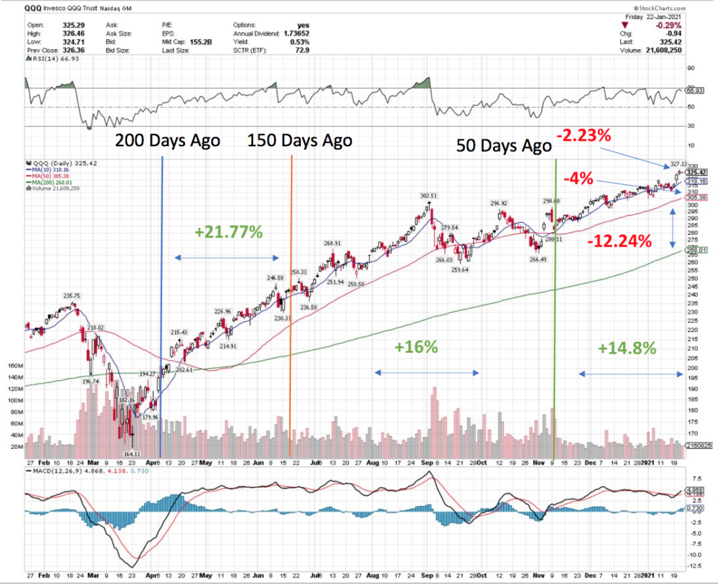
Using the QQQ ETF again, I added in an additional yardstick at the 150 day ago mark. Note that the 200-150 day ago period QQQ grew by almost 22%, while between 150-50 days it increased another 16%, followed by ~15% growth in the last 50 days. That rapid spring recovery is a major reason why the 200 Day Moving-Average has the spread between the 50 Day MA that is currently enjoys.
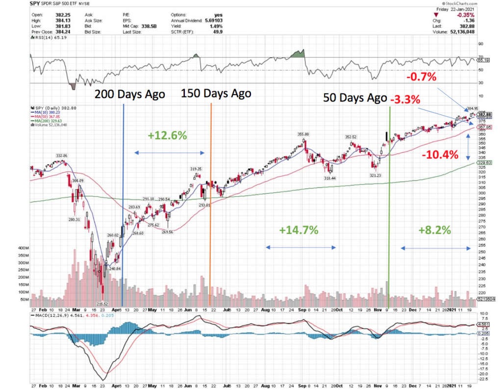
Looking at the S&P 500 via SPY, we note the same thing; 12.6% growth in the 200-150 day ago period, followed up by 15% growth in the 150-50 day window & only 8.2% growth in the previous 50 days.
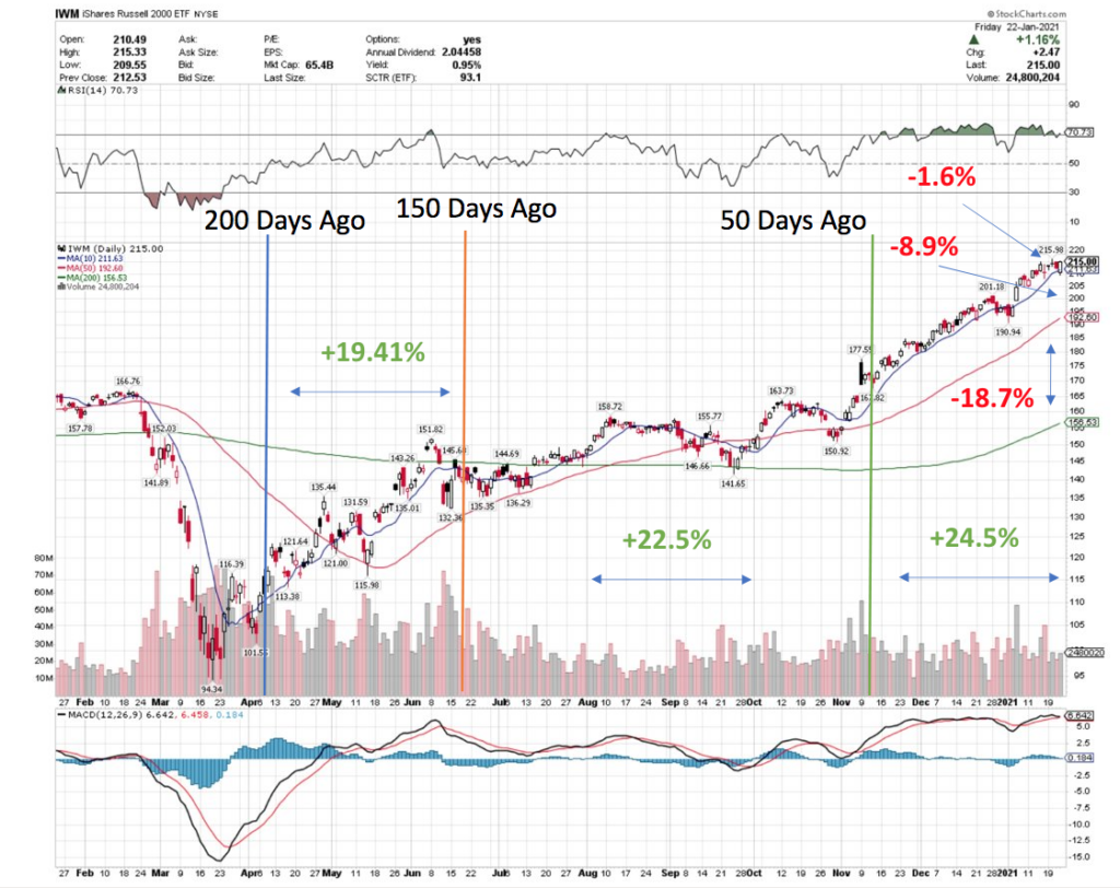
The Russell 2000 IWM ETF has fared the best, with 19% growth in the 200-150 day window, followed with increasing growth, with 22.5% gains in the 150-50 day window, and 24.5% growth in the last 50 days. This is why their 200 Day Moving-Average has shown the best amount of cushion for any pricing pullback out of everything shown as examples here.
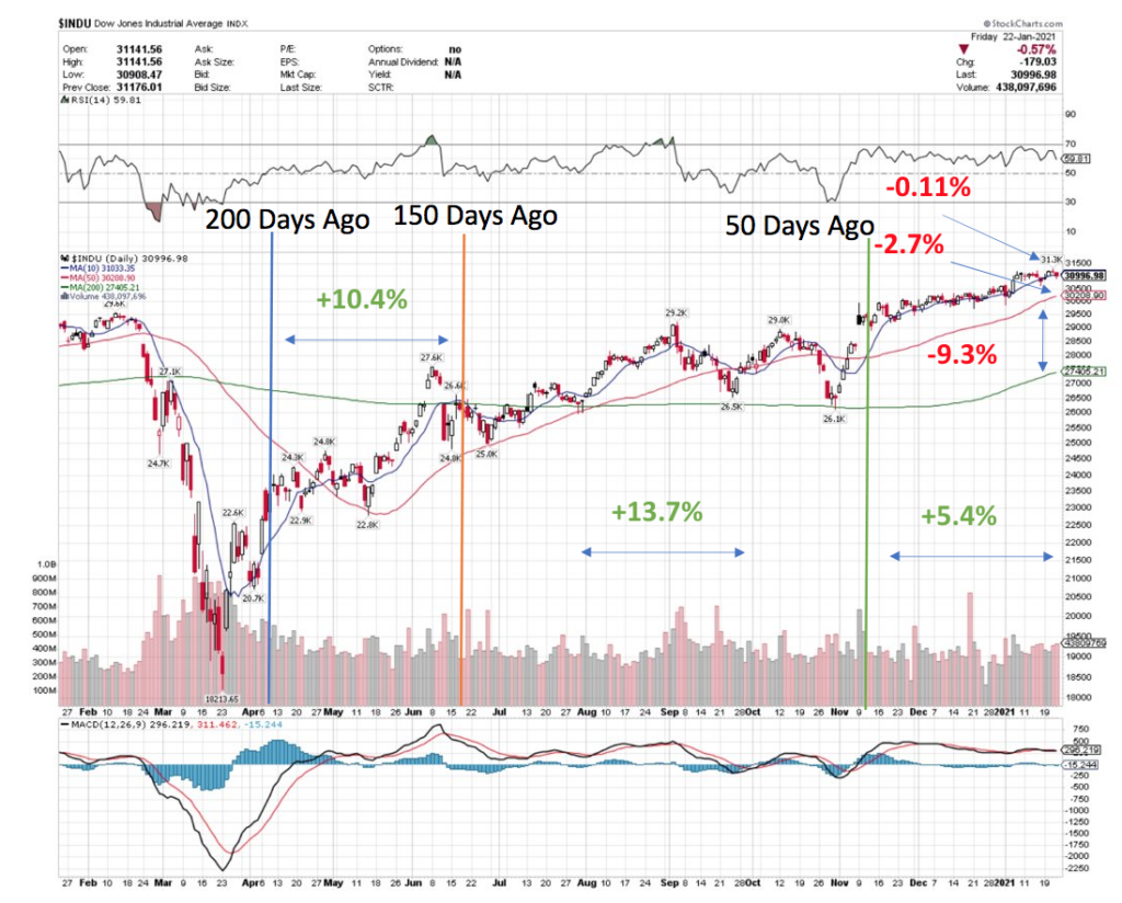
The Dow Jones Industrial Average has the worst recovery:recent growth story, to be expected based on our last DJIA chart. With 10% growth in the 200-150 day window being followed by a 13.7% increase in the 150-50 day period, and only 5.4% growth in the last 50 days.
Tying It All Together
All-in-all, if we continue to tread water the way we have been compared to last spring’s recovery growth, this will only make the major moving averages get closer together. This will then make any normal correction become potentially much more dangerous, as the downside movements in price will come much closer to breaking the long-term trend, if they don’t blow right through them.
With this in mind, it is becoming more & more essential for traders & investors to have a hedging strategy in place, and be ready to actively trade during the upcoming downward motion, whenever it ends up happening. It appears that the sooner it takes place the better it will be, as otherwise there will be more obstacles to overcome from a technical perspective.
Perhaps its best if the bandaid is ripped off now, before a cast & sling are required later on down the line…